The simple trick to increase your conversion and treble your leads
If you’re short on time…..
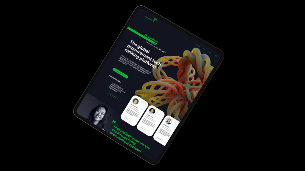
A leading web development agency, turned to Mighty Atoms to boost underperforming lead conversions. Despite a solid site, their “Contact Us” page converted at just 0.3%. MA redesigned the contact experience using proven tactics — simplifying the form, improving mobile usability, and optimizing calls to action. The result: conversions more than tripled to over 1%, generating 30+ high-quality monthly enquiries. This case shows how small, strategic tweaks can deliver major business impact. Key insights include tracking drop-offs, using heatmaps, reducing form friction, and A/B testing — all focused on creating a faster, simpler, more human experience that drives real action.
If you want the detail…..
Getting conversion right isn’t just a matter of design — it’s the difference between a website that looks good and one that drives real business growth. When a leading web development agency approached Mighty Atoms (MA) for help with lead generation, it became clear that even the most technically sound sites can underperform where it matters most: turning visitors into enquiries.
MA’s discovery audit revealed the “Contact Us” page was converting at less than 0.3%, significantly below industry benchmarks for professional services. With a major site rebuild on the horizon, we saw an opportunity to test a new approach. Using proven best practices, we designed and implemented a refreshed contact experience — simple changes that delivered outsized results.
The outcome? Conversion jumped to over 1%, effectively tripling the number of leads and contributing to the 30+ high-quality enquiries now coming in each month. It’s a powerful reminder that when done right, small tweaks can unlock major performance gains.
💡Analysis: How to Spot (and Fix) What’s Hurting Your Website Conversions
Track Who Starts — But Doesn’t Finish. Are people clicking into your contact form but not submitting it? Tools like Google Analytics or Hotjar can show you where they drop off — and why it’s costing you leads.
Watch Real Visitors in Action. Session recordings let you see how people actually use your site — where they hesitate, scroll past, or give up. It’s like mystery shopping your own website.
Identify the Form Fields That Frustrate. If a certain question or field is slowing people down or causing them to quit, it’s probably doing more harm than good. Keep it simple and focused.
See Where People Click (or Don’t). Heatmaps reveal how visitors interact with your page — are they noticing your call-to-action or scrolling right past it? Visibility drives action.
Compare Mobile vs. Desktop Performance. If your site works great on a laptop but poorly on a phone, you’re losing mobile leads. Check load times and form usability on both.
Speed Matters. A slow site is a silent killer of conversions. Run a quick test with tools like Google PageSpeed — even a 1-second delay can lose a lead.
Make Your Call-to-Action Clear and Compelling. Your “Contact Us” button shouldn’t say just “Submit.” It should tell users what they’ll get and why it matters — think “Get Your Free Quote” or “Book Your Consultation.
✅ Improvements: Simple Fixes That Turn More Website Visitors Into Leads
Keep It Short and Simple. Long forms scare people off. Only ask for the essentials — name, email, maybe a quick message. The fewer the fields, the more leads you’ll get.
Make It Work Brilliantly on Mobile. Most people visit your site from their phone. If it loads slowly or the form is hard to fill in, they’ll bounce. Prioritise mobile speed and usability.
Build Trust Instantly. Add testimonials, client logos, or “as seen in” badges near your form. People feel more confident reaching out when they see proof you’re credible.
Use Buttons That Speak to Value. Ditch the dull “Submit” button. Instead, use something more human and specific like “Get My Free Quote” or “Book My Strategy Call.”
Show Errors in Real Time. If someone types something wrong, show the error while they’re filling it out — not after they hit send. It saves frustration and reduces drop-offs.
Make Forms Fill Themselves (Almost). Let browsers auto-fill common details like name and email. The easier it is, the more likely someone will complete the form.
Offer Alternatives to the Form. Some people prefer to talk. Add a live chat option or a “Request a Callback” button for those who want a quick human connection.
Say Thanks (and Mean It). After someone submits a form, show a friendly confirmation message — and follow up with an email so they know you’re on it.
Test What Actually Works. Not sure what’s best? Try different versions of your page and use AB testing
If you want to find out how to supercharge your conversion drop me a line or set up a meeting here.